
Understanding the normal distribution with graphs.
Normal probability graphs(bell curves) describe a phenomenon that occurs frequently in business and in life. When an assumption of normality is appropriate, some powerful techniques are available. The quickest and easiest way to judge normality is to observe the shape of the data graph. If the shape of the graph looks like a known bell curve then a normal assumption is probably warranted.
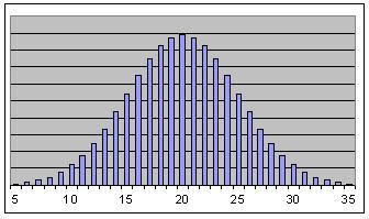
The graph shown below is the shape of the famous bell curve. This bell curve drawing is the same as a normal probability curve. This is the density curve. Density curve means that it shows the likelihood or probability at any given point on the curve. This illustrates the strong central bias for any given data point.
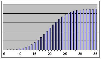
The shape of the cumulative curve is probably not as familiar, but it is more useful. Starting from the left and moving to the right, the cumulative curve is the summation of all the points on the bell curve or the density curve behind or to the left. This is the curve used to calculate useful probabilities.
When data follows the bell curve pattern, it is said to be normal. When the data fits the normal assumption, then there are facts that can be determined about that data. First it is necessary to calculate the mean and standard deviation. When that is accomplished, one can state what the probability is for a data point to fall within a given range of data values. This can be accomplished with a calculator or a set of cumulative normal distribution tables.
The normal probability graphs illustrate the familiar bell curve. It shows the central tendency of any data set that is normal. The cumulative curve is more useful for calculations. After the mean and standard deviation are calculated, probabilities of data occurrence can be assigned to any given range within the data set.

The links below are specific questions and answers about statistics and how to use them.